Project illustration toolkit · 2023
Finnish Transport
Infrastructure Agency
A modular illustration toolkit for turning real transport environments into simplified, recognisable public information
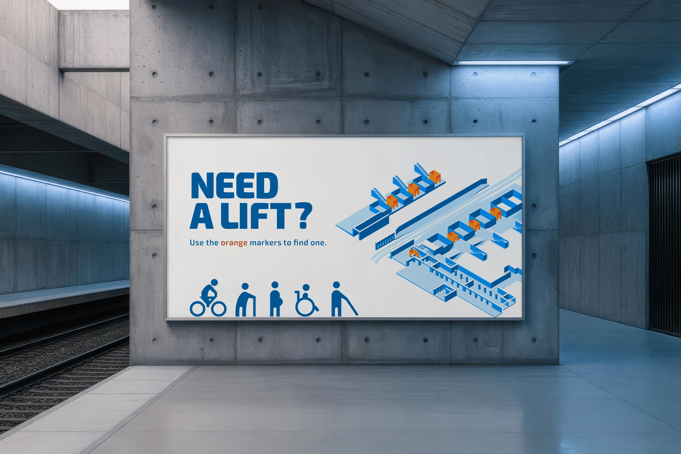
The Finnish Transport Infrastructure Agency communicates projects ranging from regional transport networks to individual stations and road sections. Working within the agency's existing visual guidelines, I developed a modular illustration toolkit for use across individual transport and infrastructure projects. Rather than defining an agency-wide standard, it applies the established identity to recurring needs for clear diagrams, project illustrations and public-facing graphics.
Designed across scales
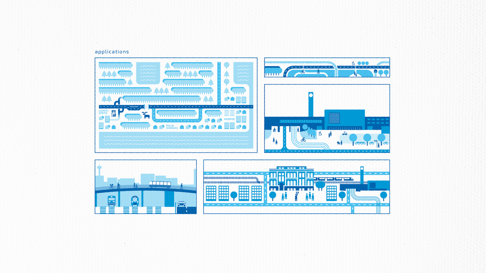
An illustration might need to show a 100-kilometre regional route or explain how people move through a 30-metre site. At either scale, the important relationships must remain legible without filling the image with unnecessary detail.
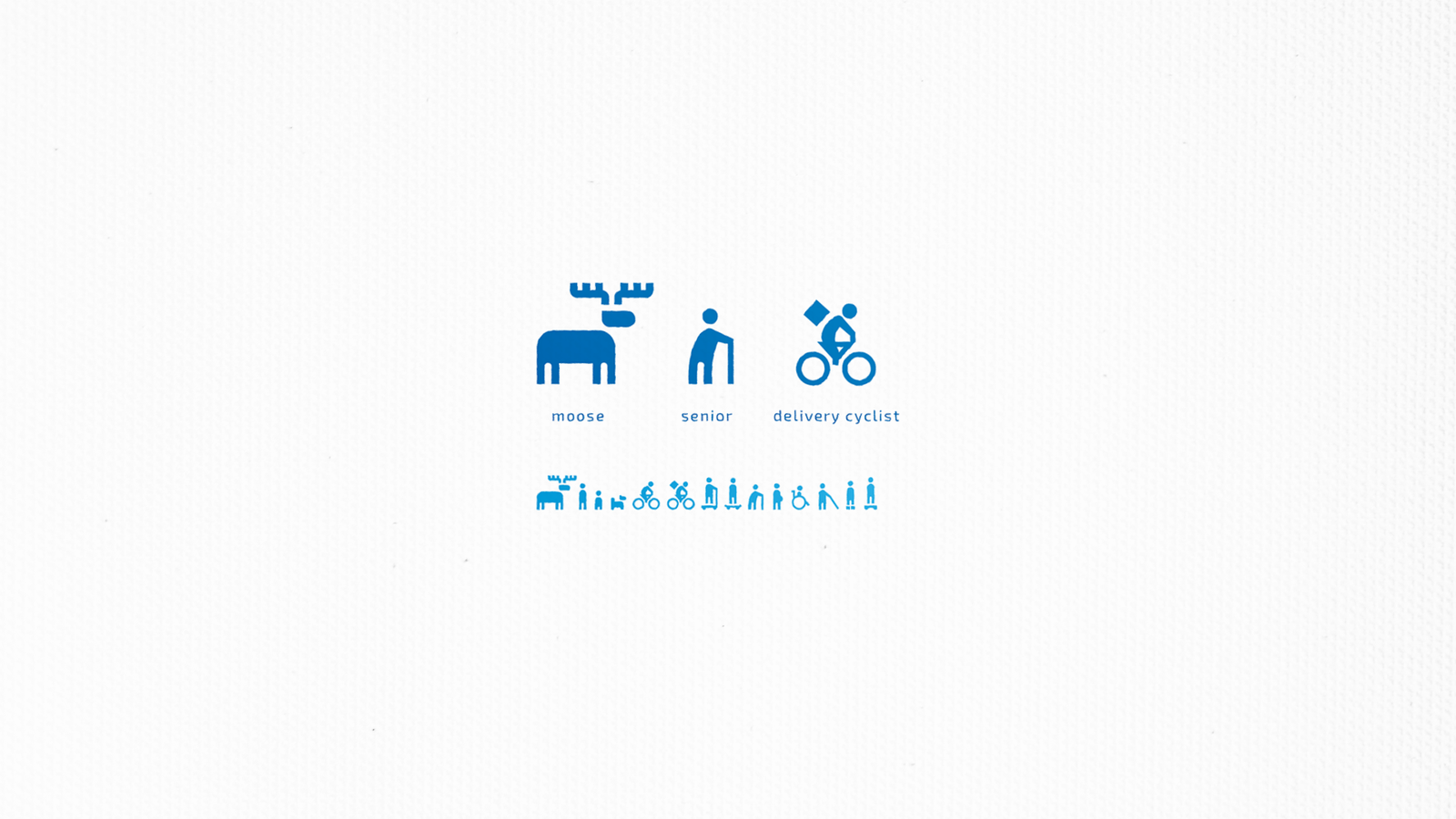
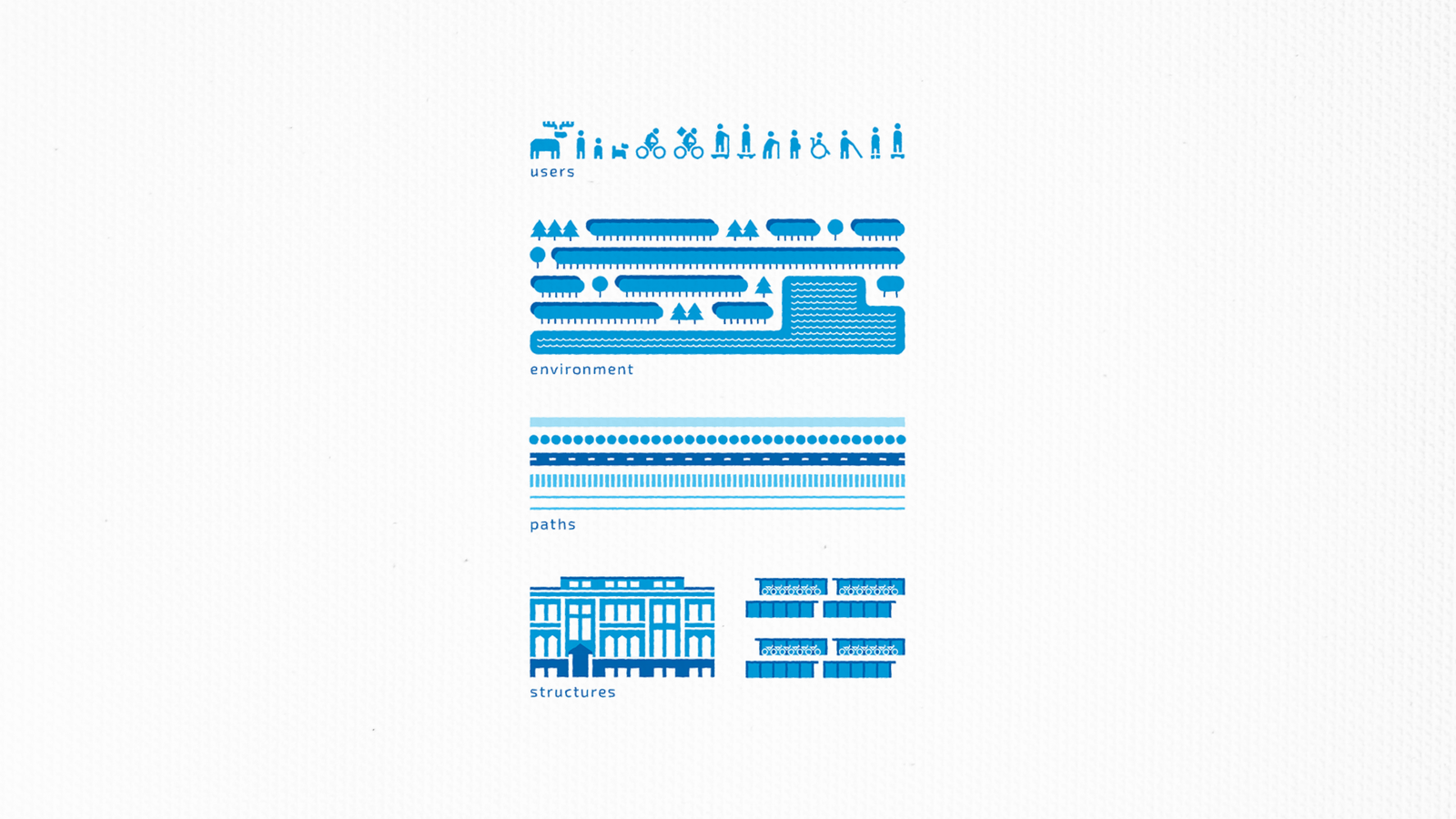
I reduced each subject to the features needed for recognition and built the visual language around the agency's three blue tones, simple vector geometry and generous white space. People, animals, roads, railways, landscape and buildings share the same principles, allowing them to appear together without any category feeling borrowed from another source.
Building recognisable places
The illustrations do not reproduce real places road for road. Instead, they preserve the mental map of a place: the buildings, bridges, crossings, routes and spatial relationships that allow a local viewer to recognise it. Overhead views, cross-sections and shallow spatial scenes simplify real geography while retaining the landmarks and connections that give an area its identity.
Standard components cover recurring needs, while the same principles can be used to draw a specific building, structure or geographic feature. New scenes can be assembled from an established base and extended with only the detail each place requires. The library developed through practical use, with new components added as projects introduced new environments, structures and users.