Visual system · 2021
muna.io
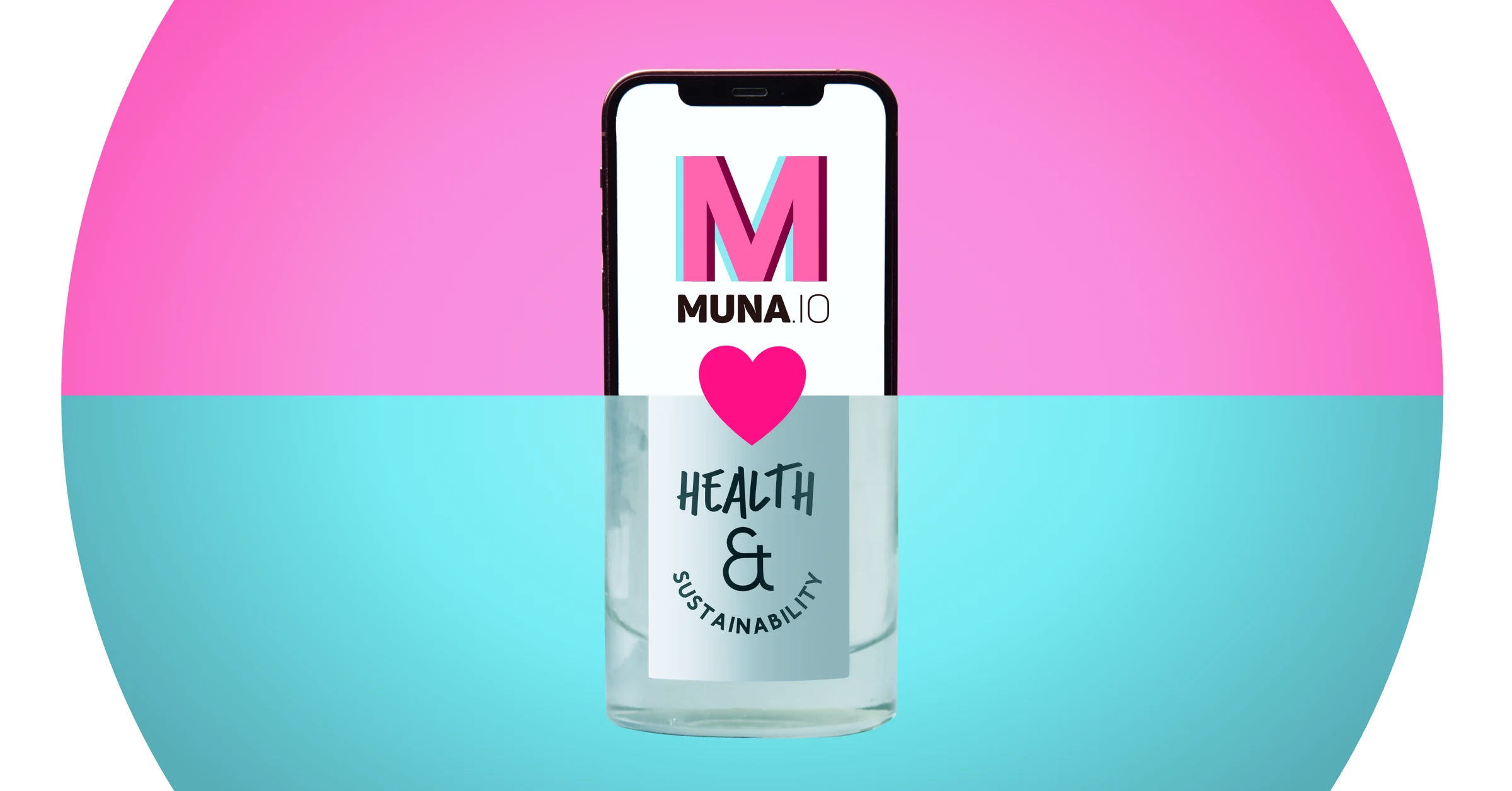
A loud, modular social-first system that taught me how far a visual language can stretch
muna.io was a young platform for healthier and more climate-conscious shopping. The company wanted a fresher visual direction for young adults: energetic enough for social media, recognisable beside contemporary sustainable brands and still connected to its original identity.
One language, many voices
I developed two related directions from the existing hot pink, cyan and dimensional M. The lighter “Ice Cream” direction became the main campaign language; a darker “Berry” variation offered a more formal register without abandoning the same visual DNA.
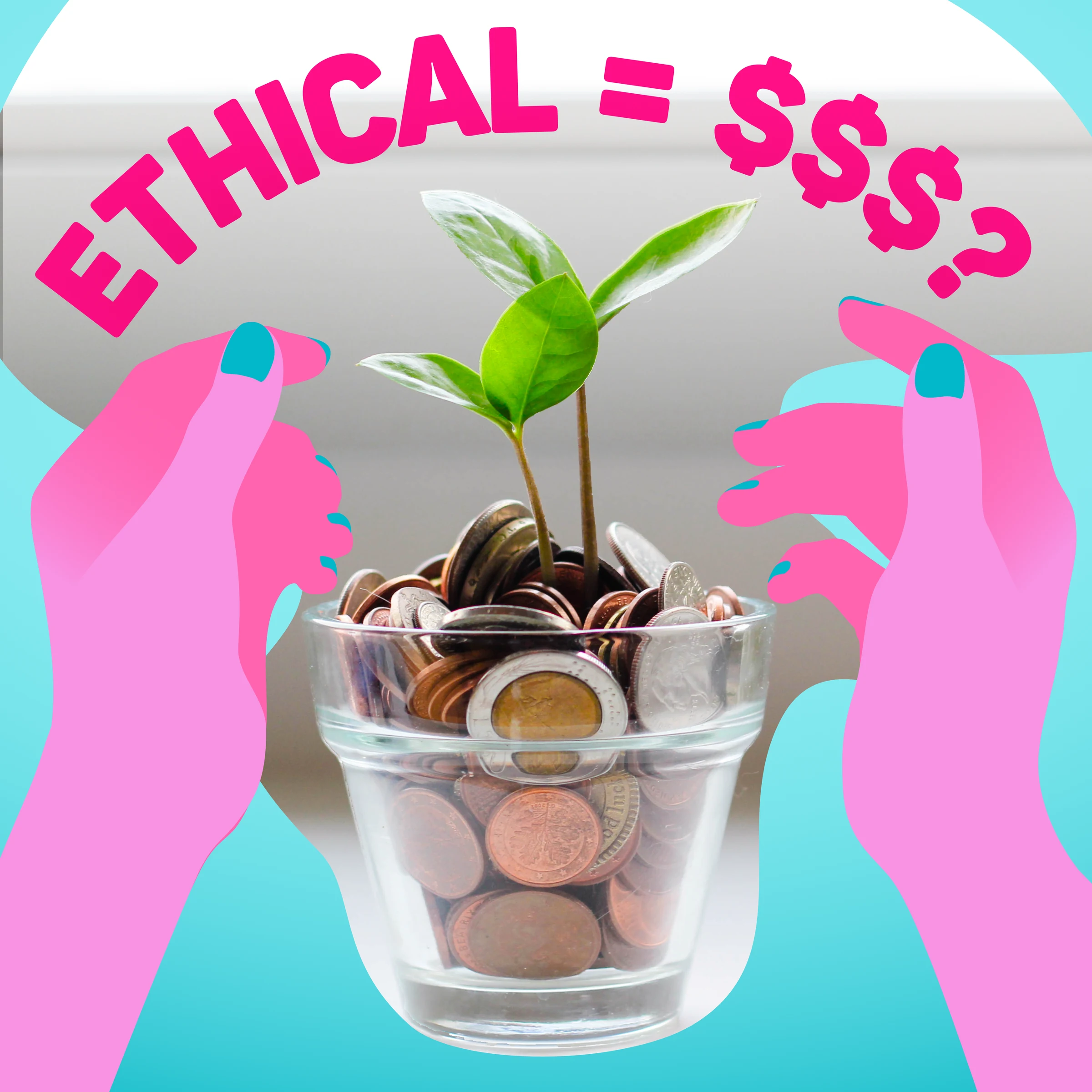
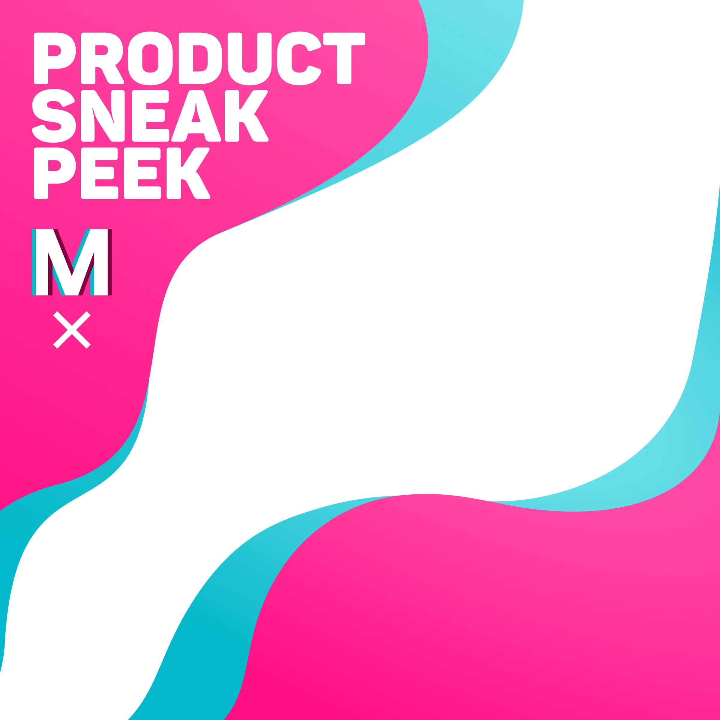
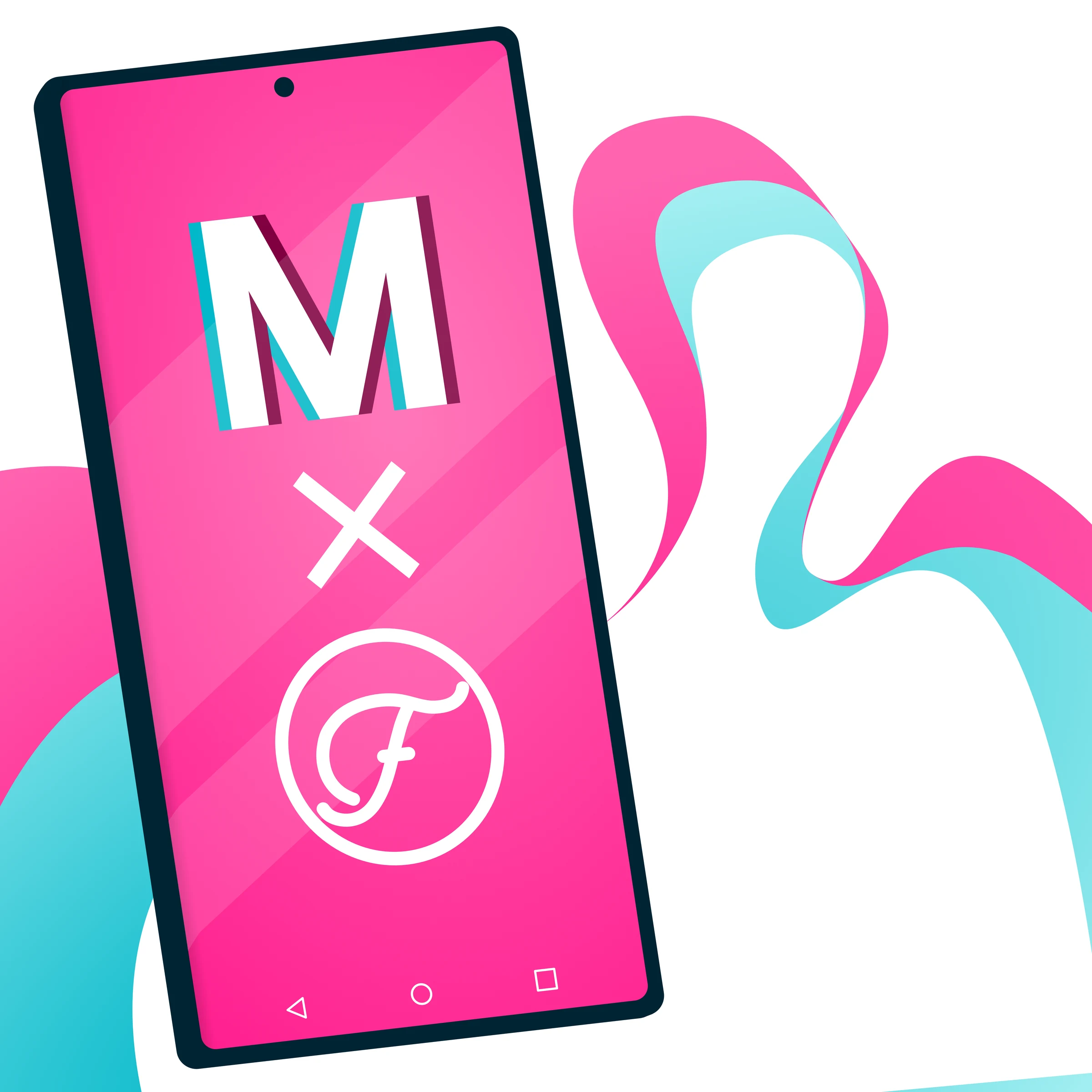
Rather than designing isolated posts, I built a kit of repeatable behaviours: fluid edge shapes, oversized typography, phone frames, bold crops and modular collaboration marks. The same ingredients could promote the app, announce a partner, explain sustainable choices or introduce a product without every post becoming the same template.
A formative system
The work is louder and less restrained than what I make today, but it was formative. It pushed me to trust colour, design in campaigns rather than single compositions and ask what must remain consistent when a visual identity is stretched across many kinds of content.
That lesson still sits underneath my current work: establish a small number of strong rules, then give them enough room to generate variety.