Visual identity system and phased rollout · 2026
Welado Group
An identity system balancing technical precision, human warmth and brand continuity for a Nordic infrastructure group of more than 500 people
A major acquisition brought Welado and OMT under one group brand, alongside several smaller specialist companies. Working directly with executive stakeholders, I led the visual development from early proposals through guidelines and phased rollout, balancing established recognition, differing internal attachments and the practical demands of implementation.
Two identities, one group
The process began while the group’s structure was still evolving. Continuity with OMT’s existing mark was a leadership priority, while Welado employees strongly identified with purple as the company’s most recognisable visual asset.
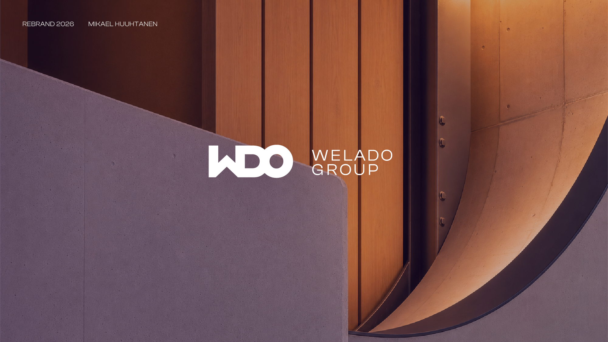
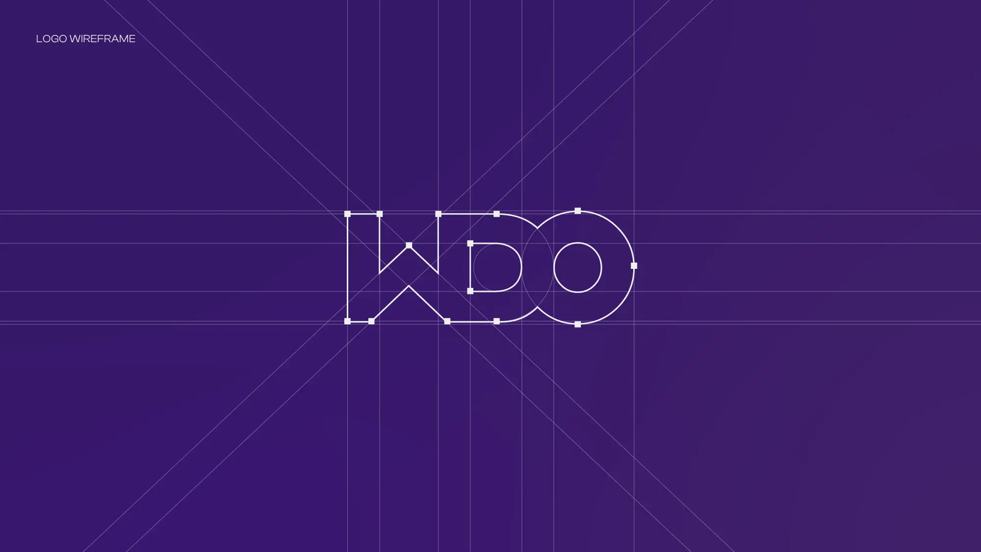
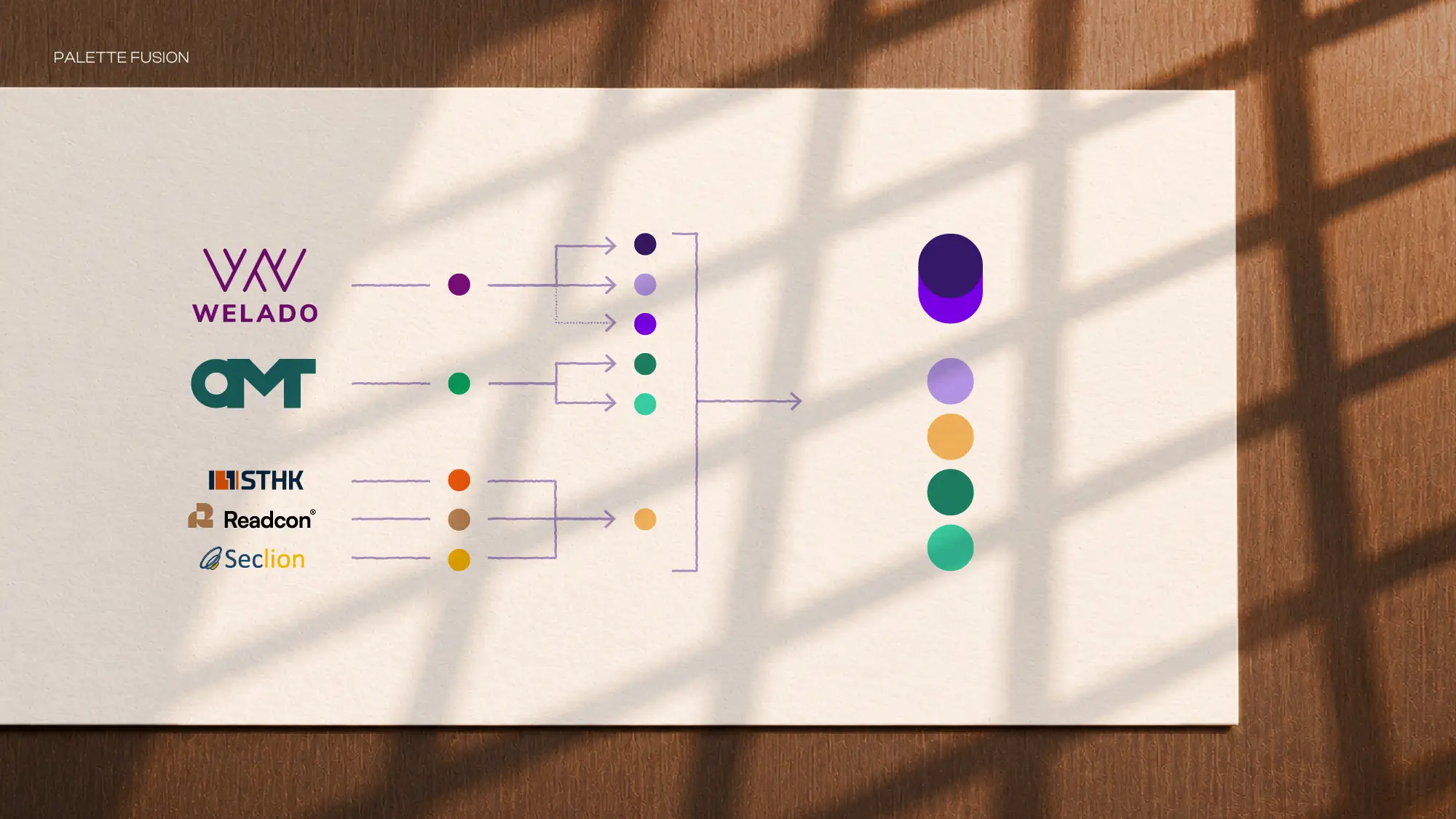
The executive team specifically wanted the group symbol to read as WDO while retaining OMT’s familiar geometry. I shaped the resulting mark to also suggest the side profile of a person, bringing Welado’s softer, human values into an otherwise technical form. To keep the full Welado name clear in everyday use, I developed full-name lockups as core identity assets rather than optional secondary versions. Purple established the masterbrand, while supporting greens and yellow preserved points of continuity with other companies joining the group.
Technical precision, human warmth
The visual system balances the precision expected from an infrastructure consultancy with the human culture Welado wanted to preserve. I shifted the existing purple towards a deeper, cooler royal tone. Its saturation keeps it technological and forward-looking, while the darker value adds authority and reliability. Retaining some of the original warmth keeps it recognisably Welado and credible as a long-term group colour.
Clash Display brings controlled distinctiveness to headlines. Its strong geometric construction feels contemporary and engineered without becoming aggressively technical or overly expressive. For everyday communication, Calibri keeps the system accessible within the organisation’s Microsoft-based workflow.
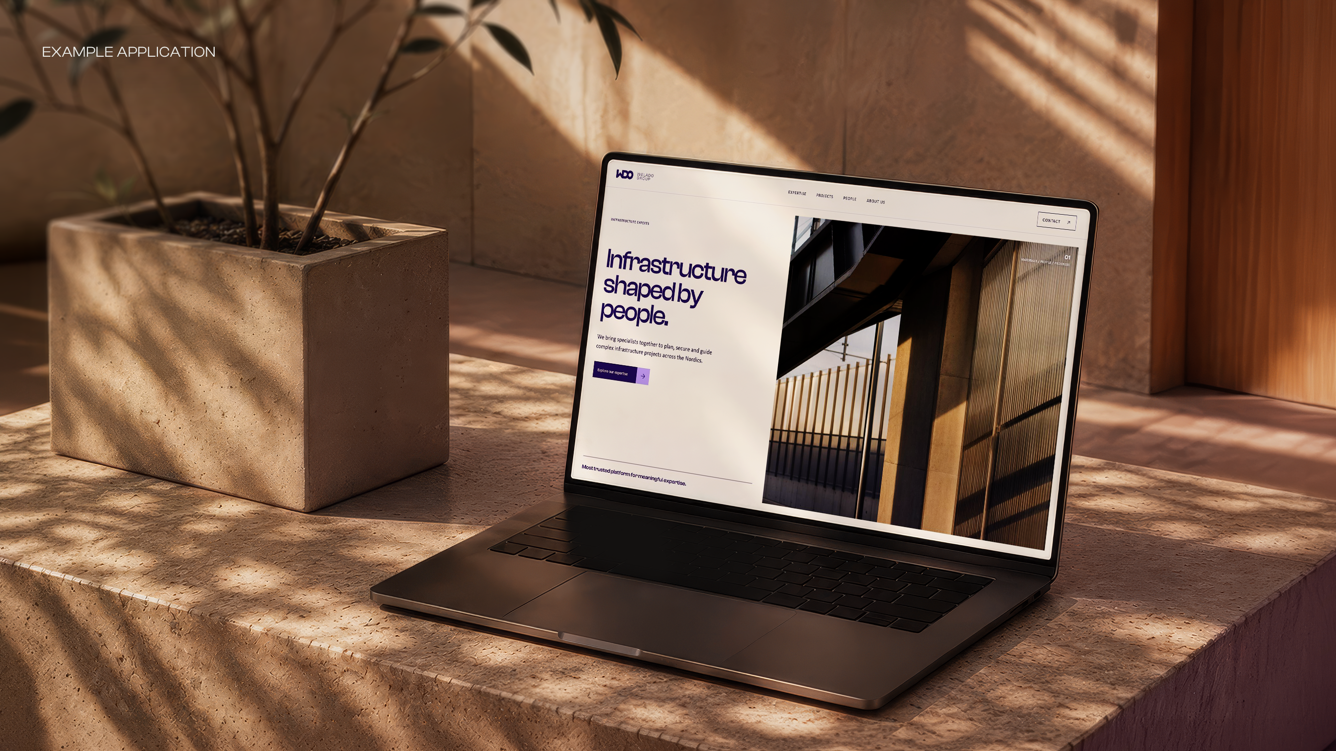
Warmth enters the identity as light. Directional sunlight moves across concrete, steel, glass and other infrastructure materials in photography. In gradients, the same principle becomes concentrated colour and illumination rather than decorative atmosphere. The light can suggest industrial heat, energy and human presence without relying on generic corporate photographs.
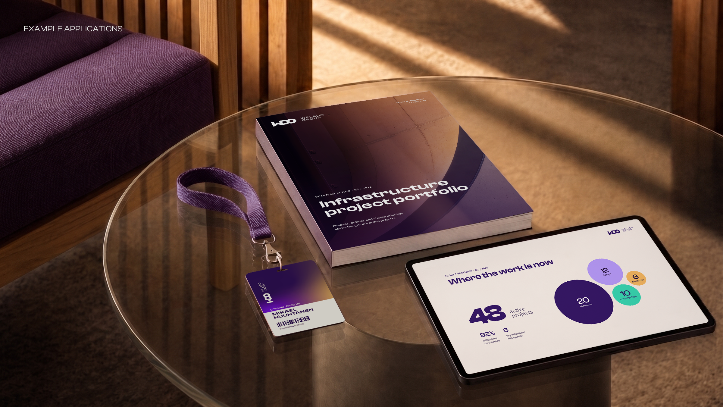
Circular forms act as data nodes and points of focus, organising information while adding controlled moments of colour and softness to otherwise structured layouts.
Designed to survive real use
The identity needed to function without constant design oversight. I created guidelines, application principles and a phased implementation plan that prioritised high-impact touchpoints before expanding into templates, digital channels, project documents, signage and shared assets.
Clear file structures, central asset ownership and repeatable templates made the system practical for internal teams, external suppliers and everyday tools such as Microsoft Office and Canva. The identity is now in broad use across the group, supported by a flexible framework that can expand as the organisation evolves.